

OMBAS Brand Redesign

The old OMBAS logo was outdated and kitschy. A more refined color palette and simple more timeless typefaces with a minimal graphic element were chosen to elevate the brand.

A conference within the trade show, Jewelry History Series has never had it’s own logo or identity. I sought to make a logo that could stand up on its own but also had definite connections to the show logo through typeface, color, and graphic elements used.


COLLATERAL

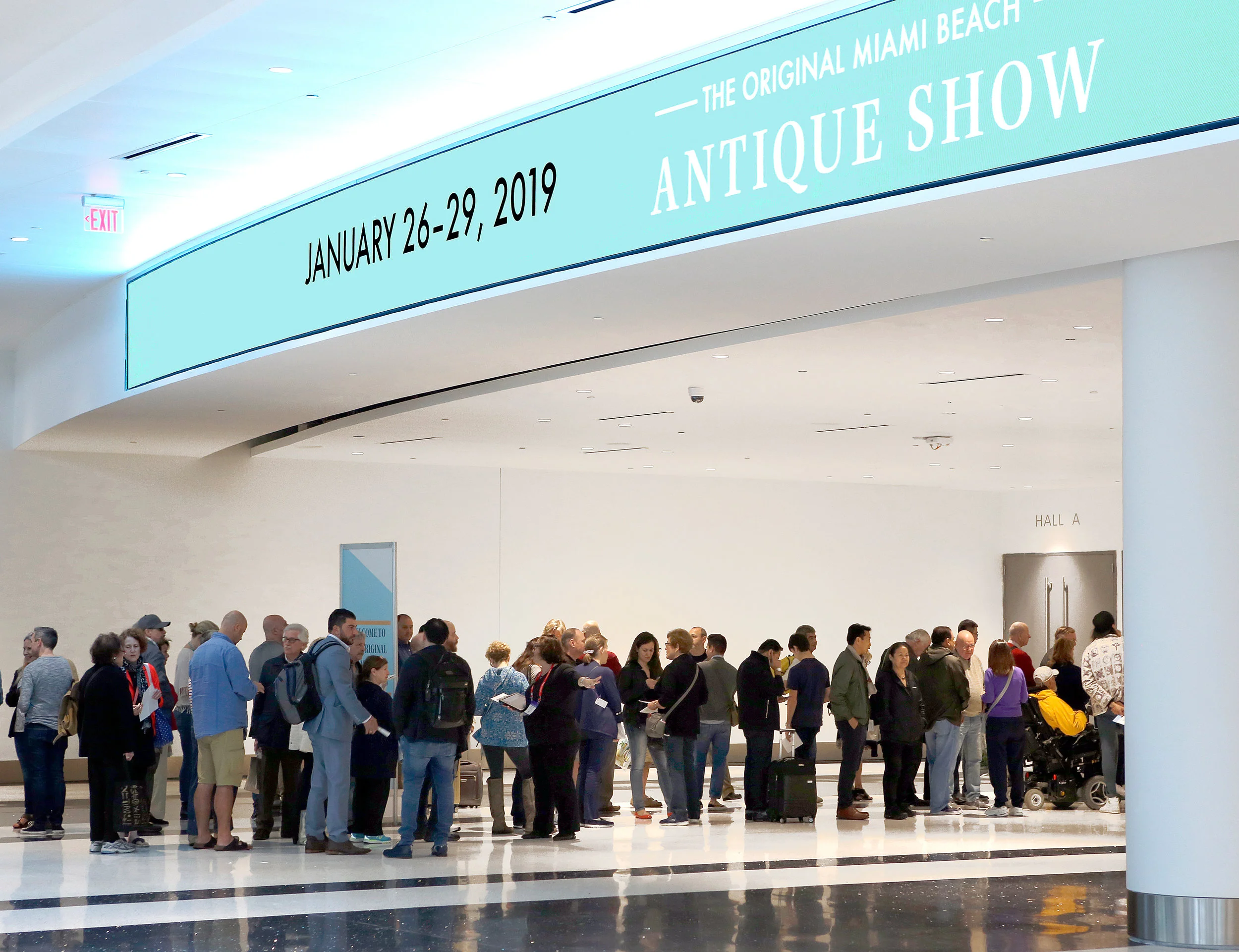
Since the date pattern changed for the first time in 50 years, all collateral is emphasizing the date foremost. This was a direct mailer sent out re-emphasizing the benefits of attending the show and then calling for people to preregister online.


Off of the tagline DISCOVER. UNCOVER. EXPLORE. I created a series of three ads. Each highlights one part of the tagline and one element of the show (furniture, objects/fashion, and jewelry). These ads are segmented to hit a specific target audience. For example, if we are advertising in a jewelry publication we would use EXPLORE, but if we were advertising in a home decor/interior design publication, DISCOVER would be used.

OMBAS HOLIDAY CAMPAIGN


Blue and gold is combined to call on Miami’s beach-y nature while staying non-denominational and joyous. Hand-done illustration and typography are used to humanize the brand and call on the customers feelings of home and happiness associated with the holidays and associate them with the brand. Motion graphics are are used in digital campaigns to increase viewership. We saw so much interaction with this when used as an email header that it was deployed four separate times with continued success.


